Email marketing is a consistent way to cater to your customer’s needs while simultaneously promoting all the latest products or services that you offer. It is always important to reach customers after they’ve left your website.
But any old email won’t be able to help. To capture attention and encourage customers, it is important how you present your email content. The font for email is one of the important aspects. It becomes easier for customers to read, and they are more likely to convert easily.
In this article, you will be able to know the 10 best fonts for emails that have high conversion rates.
Why Do Fonts Matter?
Try to read the below text as soon as possible. You might have a tough time reading the passage. An easy-to-read font makes it easier to instantly read the text.
That is why your email font can make or break your email campaign’s success. Most readers will delete an email after the first 3 seconds if they are unable to read it.
The overall quality of an email depends on the font used for the email. For instance, if you are raising funds for some calamities, then using Comic Sans MS will show that you’re not a credible entity.
Categories of Email Font
There are more than 130,000 fonts available but all fonts are majorly categorized into four types. Let’s discuss them in detail-
Serif
Serif fonts include decorative strokes at the end of each letter. These types of fonts are formal, traditional, old-fashioned, and reliable. Serif fonts are mainly used for headings and large-sized text. For example, the logo of vogue is written in a serif font.
Sans Serif
Many businesses prefer sans-serif fonts over serif ones. Sans serif fonts don’t include decorative strokes and appear modern, clean, and humanistic. These are most suitable for an email copy as are easy to read. For instance, the logo of Google is written in sans serif font.
Script
Script fonts are like cursive handwriting. These fonts are elegant and classic, inspired by 17th-century formal writing. Though these are not ideal for email usage but great for creative headings. Coca-Cola is the most popular script font.
Decorative
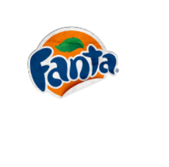
Decorative fonts look artier rather than practical. These fonts are easily identified by their unique and unconventional design. Fanta is a great example of decorative fonts.

10 Best Email Fonts
Let’s have a look at the good, readable fonts for an email design that have been tried and tested to work well for emails.
Arial
Arial is a sans-serif font that is used in digital media and print. It is versatile, modest, and simple and is widely used for email marketing.
Verdana
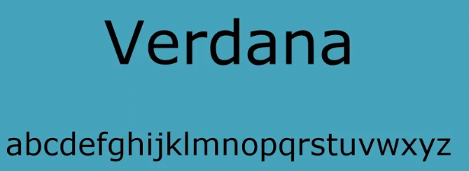
Verdana is also a sans-serif font and is used for screen displays. In this uppercase and lowercase letters have adequate space between them. These are extremely easy to read and ideal for the body of an email.
Georgia
Georgia is a serif font that was introduced by Microsoft. It is widely used in newspapers and magazines as it is authoritative and formal. It is the best option for longer email content as the wide-spaced letters make it easy to read.
Helvetica
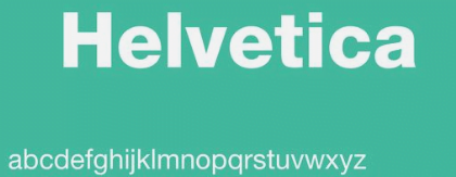
Helvetica is also a sans serif font in typography style and is famous for being bold and modern. This font is used in headings and logos but is not suitable for an email body. As the letters are close together, long email texts are challenging to read.
Tahoma
Like Verdana Tahoma is also used mainly for screen displays. It is also a sans serif font and has similar lengths of both its upper and lower case letters. It provides good readability and an overall clean appearance.
Times New Roman
This font was introduced by the Times newspaper and is one of the most popular font styles of all time. Time New Roman is authoritative, classic, and traditional and is used for headings only. The letters are narrow and make reading large texts a challenge.
Open Sans
Open Sans is a web and sans serif font. It has witnessed tremendous growth in recent years and is used in digital content. This font is easy to read and appears friendly, minimal, and simple.
Roboto
Roboto is the most popular Google font developed for screen displays. It is a sans-serif, web font that has high legibility. The font has adequate space and full curves which makes it ideal for headings and body text.
Raleway
Raleway is a sans-serif font used on the web. It has 18 styles, from thin 100 to black 900 for different elements of an email copy. The font displays thin letters presenting an elegant appearance.
Lato
Lato is one of the best fonts for email design. It is a sans-serif font and is ideal for long and complex text passages. The letters are well-rounded and provide a natural appearance. Lato font is simple, friendly, and welcoming.
Choose the Best Fonts for Email
The selection of the best fonts depends upon the message you want to convey. The typography style should complement the overall message. So, let’s have a look at the following examples of when best to use certain fonts.
- Times New Roman- When highlighting your yearly performance or discussing your unique selling propositions. This font creates an impact and gathers attention.
- Open Sans- When showcasing a product line. This font makes the readers read the email and click on the call to action buttons.
- Helvetica- Used in promotional headings. It grabs attention while offering seasonal sales or coupons.
- Arial- Used for lengthy newsletters to make them easy to read.
Email Fonts Best Practices
Always go through the best practices when using your preferred font styles.
Number of Fonts- Never use multiple fonts. Use 2 fonts at maximum within an email, one each for the heading and body.
Font Size– Keep 22-28 pixels for headings and 12-14 pixels for the body for both desktop and mobile screens.
Font Alignment- The optimal alignment is left. It is easy to read, and scan, and provides enough white space to give your eyes a break.
Font Colors-The font colors chosen should complement the background. It should be light-colored with not more than 3 colors.
Line Spacing-The ideal spacing ranges between 1.5 to 2 lines preferred by most of the readers.
Call to Action Buttons- Call to Action buttons grab the audience’s attention. The CTA button font should be different from the font chosen for the body of the email.
About Post Author
Anant Gupta
Growth Hacker, Marketing Automation Enthusiast & Founder of GrowMeOrganic


