According to an email statistics report of Radicati Group, the total number of consumer emails received and sent per day will be more than 319.6 billion by the end of 2021. With the number of emails sent each day, it is difficult to stand out from all the others sent directly in your inbox.
The first step to creating amazing content that your audience finds relevant is designing an email template. Email templates for follow-up will draw the attention of your readers. In case you are wondering how to create email templates, let’s have a look at this one.
What Is An Email Template And Why To Use Them?
An email template design is a pre-written or pre-formatted email that has a subject line, an email copy, an actionable call-to-action, and a CAN-SPAM footer.
This way you can add images, links, and your text instead of building a template from scratch. Email templates save time as you have to focus on writing the content of the email and not on creating a template.
It avoids the hassle of creating a template that involves complex code. Moreover, templates ensure that your emails have brand and format consistency.
The email template can be in the form of-
- Plain text email.
- HTML mail template.
- Interactive email
Plain Text Email
Before the 1990’s emails were used in the form of plain text emails available only in Unicode formatting. This contains a Unicode font and left-aligned text only. Then in the early 1990s with the integration of HTML coding, HTML was widely adopted.
Nowadays, email service providers send a plain text version with their HTML counterparts. Also, to avoid emails from spam folders, many email marketers prefer to create a plain text version.
Moreover, some email clients do not support HTML versions and your email gets into spam folders. As per the data, plain text emails get better open rates than HTML email templates.
HTML Email
HTML mail is a rich version of plain text email. HTML emails can be manipulated to create an attractive email irrespective of using <div> or <table>.
HTML emails help to create a seamless experience across your website. You can add different hyperlinks that can be linked to different buttons. You can include an image that speaks more than words can describe.
With an HTML email, you can track the performance of your email campaign. Lastly, HTML emails can avoid spam filters.
How To Choose Between Custom-Made Template Vs Ready-Made Template
ESPs provide options of different email templates that are greatly helpful for email marketers who are starting. So, ready-made templates are best for sending last-moment email campaigns. These email templates are free or available for a small fee. This, in turn, reduces overall email template production costs.
In ready-made templates, you won’t be able to customize your emails enhancing brand identity, and exclusivity. Ready-made templates are no longer an option as most people prefer to customize their emails.
On the contrary, custom-made email templates are unique. These are customized according to your requirement. A lot more people are required for creating a custom template from designing code to testing the custom email templates.
Hence, the overall cost and turnaround time while planning a custom email template is more.
Creating Email Templates
Email templates are like outfits that can be tailored according to a certain occasion. For instance, a welcome email template consists of a short email copy with a visually rich layout. This is your first conversation with the subscriber. Lead nurture emails are descriptive with individual CTA buttons. Transactional emails include the invoice of purchase along with some cross-selling.
Welcome Emails
A welcome email is an email thanking the subscriber for subscribing. The email copy should introduce your brand and the call-to-action should be included.
The call-to-action should prompt the subscriber to complete their preferences and update their profile.
Newsletter Email
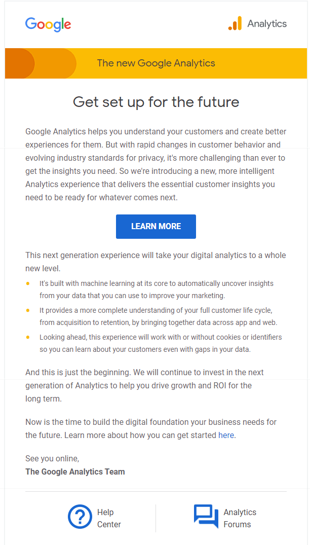
This periodic email tells and informs the subscribers about your brand and its products/services. These types of emails make your subscribers purchase your brand.
Sale Promotion Emails
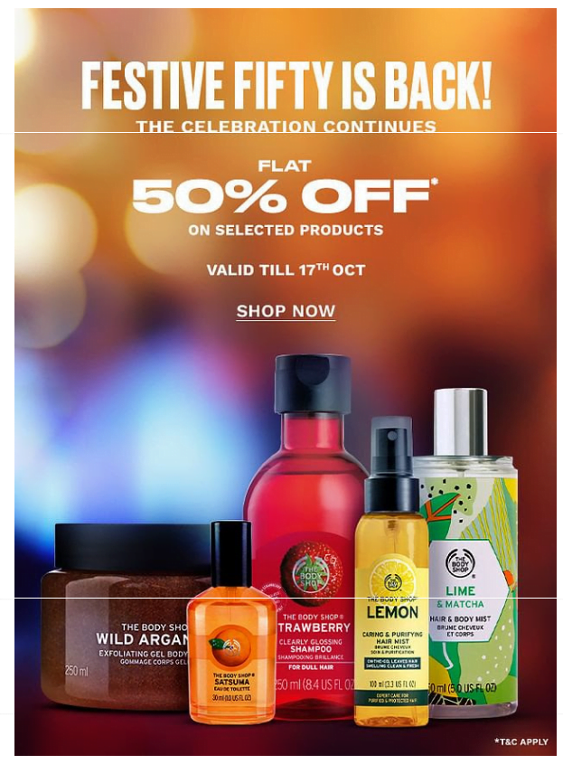
These emails transform email subscribers into customers through marketing and making the subscriber believe that this purchase will solve their problem
Order Receipt Email
This email is triggered and confirms the purchase made by the subscriber & is used to promote other relevant products. The ratio needs to be 80% transactional and 20% promotional.
Re-engagement Template Follow up email
All subscribers won’t be active and keep opening your emails. These emails will regain touch with dormant subscribers and may bring them back to your sales cycle.
Abandonment Cart Email
A well-nurtured subscriber may abandon their purchase mid-way because of many reasons. This could affect your business but these emails will draw such abandoners back and reunite them with their carts.
Email Design Cheat Sheet
A successful email will include a subject line, content with personalization, preheader, layout, etc as follows-
- SUBJECT LINE: Make it personal, engaging, and relevant. The length should be 65 characters or less. Emojis in the subject line will increase open rates.
- PREHEADER: The preheader conveys to customers how much the email is relevant. Hence, keep it short, up to 40-70 characters.
- PERSONALIZATION: Emails with personalized subject lines have a high open rate. So, personalize other information in the body of the email based on your database. Contextual marketing focuses on one-to-one engagement and customizes emails for specific subscribers to provide a more individual experience.
- DYNAMIC CONTENT: This shows different content depending on the recipient’s requirements.
- LAYOUT: Use a logical hierarchy with large images and headlines to focus the reader’s attention.
- WIDTH: The width should be 600px for most email clients.
- IMAGES: Use images that have context and meaning, but make sure your file sizes are small, but format images for high-resolution displays. Always use alt text for clarity if images don’t load.
- FONTS: Use web fonts to set a default font and make sure it’s a web-safe font, not just a System font.
- WHITE SPACE: Add blank areas or white space after every paragraph. This will help them to stand out and increase click-through.
- MOBILE OPTIMIZATION: Use a mobile-friendly template and keep the text short with easy-to-click CTA buttons.
- CTA BUTTONS: CTA buttons should be big enough to tap on a phone. The size should be around 50px tall and have high color contrast.
- MOTION: Video and GIFs add visual interest to an email, so include a GIF with a size of under 1MB or use animated videos to enhance engagement.
- COPY: Understand your audience and use an appropriate tone to make sure that you have someone else proofread your email before sending it out.
- FOOTER: Always include your company’s social links. You can also include an app download link, referral links, and contact information.
About Post Author
Anant Gupta
Growth Hacker, Marketing Automation Enthusiast & Founder of GrowMeOrganic

